
A Missing Textbook Diagram
For intro econ, intermediate microeconomics, public policy, and more

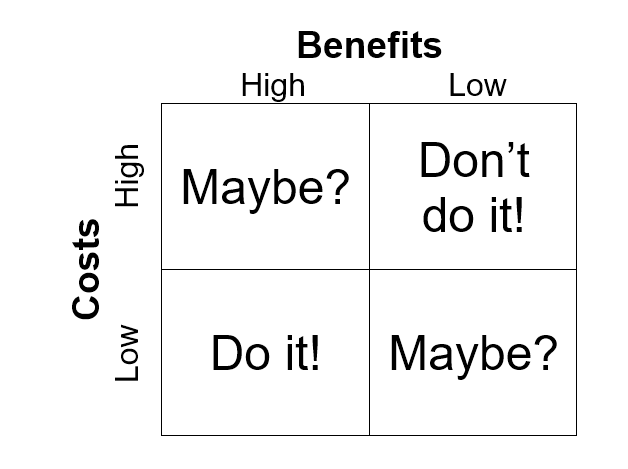
While I was touring San Francisco, the following diagram popped into my head. Obvious once you think about it, and ChatGPT says there are plenty of precursors, especially in business classes. But I don’t recall seeing anything like this in any intro, intermediate micro, or public policy textbook. And I think it would make a good addition.
P.S. You could expand the diagram to include “Sky High” and “Rock Bottom” entries, which would be helpful for explaining why my favorite policy reforms remain prudent even if all of my critics’ complaints are true. Sky High Benefits trump even High Costs.
Too obvious to post.
If we’re talking about government action, the costs are borne by someone else and the benefits are imaginary. That diagram would give me agita.